UX Case Study
Contact Energy's
In-App Referral Scheme
This hero is built with a flex layout, aligned and justified so that the content will always be centered horizontally and vertically. To change this section’s background, select the “Hero Overlay” then scroll to the background section of the Style panel and replace the image. You can also adjust the opacity of the overlay’s black background for better contrast.
About Contact Energy
Contact Energy Limited is a New Zealand electricity generator, natural gas wholesaler and electricity, natural gas, broadband and LPG retailer. They are a progressive and well established New Zealand company and have made in priority to focus on end to end customer journeys and move in a digital first direction.
The What?
With a focus on streamlining and refining current processes, they want to improve overall customer experience. And one of the areas that is being investigated as it creates nice moments for new and existing customers and achieves their business goals, is their customer referral Scheme - “Friend Get Friend”
How does the scheme work?
When a customer "Refers a friend' , they share their link or code unique to them with the person who wants to join. If the person who received the code signs up to become a Contact customer and stays a customer for 30 days, both the referrer and new customer earn $100 of credit which lands in their power account
The Brief
As the main area of focus, Contact wants to bring the referral experience into the app and in time - their online service portal (OLS). They would like a unified, streamlined 'all-in-one' solution which features all the information relevant to each part of the customers referral experience - a referral 'dashboard‘. Having all the information at the customers fingertips will lower customer service interactions minimising email and call center impact.
The solution is to fit within the structure and design language of their current app, while refining and improving upon this where necessary. The tone of voice, ease of use and level of service should reflect the quality that Contact customers are use to.
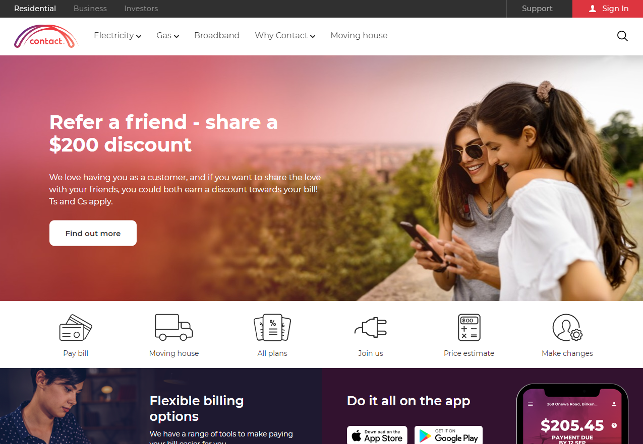
The current Contact referral scheme run predominantly through the website and as a great proposition for customers it's one that Contact are keen to amplify. What has been highlighted is the opportunity to improve the digital experience aligning to Contact's digital first direction and bring this into the app.
If Contact can provide a solution and modernise the user experience. It would positively impact the current and new customers not only because it will provide a monetary benefit to both parties and therefore a positive customer moment, but it will also provide a better overall customer experience. The business as a whole would also benefit by receiving new customers at a reasonable cost to acquire and by increasing customer net promoter scores leading to a higher CLV.
To kick off the project, I wanted to get a good understanding about consumer referral strategies in the market and also take close look at Contacts direct competitors to see what their propositions were.
Indirect Competitor Share Mechanics
Here looked into a number of in app referral mechanics from the likes of Uber Eats (food delivery app), Ola (ride share app, and Sharesies (NZ Share Trading Platform) looking into their UI, language and share flows.
What I found was simplicity, visibility of code, sharing ability, and the use of minimal clicks were used across the board, and all of the sharing capability was based in app but they gave the user the option to copy the code or share the URL elsewhere. More findings on the visuals below.
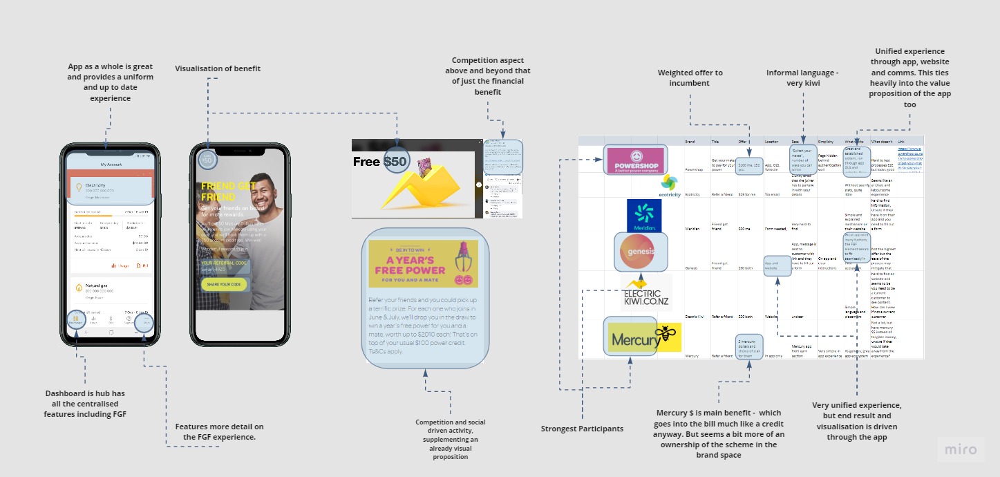
Direct Competitor Analysis
Nearly all of Contact's direct competitors had some form of referral scheme. This came with varying benefits (money or credits) and what was interesting was the size of the credit didn't have too much impact on the success (i.e. power shop and Mercury both offered $50). But the presentation of the message and the communication and simplicity of the mechanics was integral to their success. Powershop, for example, built their business with this model, and Genesis, Mercury and Electric Kiwi had this built into their app as the first port of call with the website a secondary message. Their website banners and some ads were also reinforcing this message. Digital ads and associated communications were integrated into a successful end product.
Findings
The main features from direct and indirect competitor revealed a range of features that would be great to test and bring into the end product:
Indirect Share Analysis
Click to enlarge
.jpg)
Direct Competitor Analysis
Click to enlarge
Survey - Quantitative
After the market research, I wanted to get a good idea of consumer experience with common referral schemes so I started with a survey. This was built to find out about motivations, demotivators, pain points and good experiences consumers have had with referring or recommending a product. The survey was Google Form which was circulated in multiple forums, and sent direct to people based on demographic requirements. The results can be seen further below.
This survey dove into people's experience with recommending a product or any experience with referral schemes. It asked them about why they'd stand by a brand, their motivations around why the refer and the tech and mechanics that they used to do so.
Interviews - Qualitative
For a more in depth look into our audience I moved into qualitative research. As well as an initial interview with the client to understand deeper business requirements, I spoke to a number of users around their experience with referral schemes - digital or otherwise. This provided some more insight based on their feelings, past experiences, motivations and methods of referring or recommending a product.
Client interview
I chance to have an interview with the client which provided context around the where the current friend get friend (FGF) product sat in the business' priorities. Prior to this brief, the end to end journey for FGF was refined from a EX point of view, and the business was now in a position to develop and promote this polished referral mechanic to their customer base. The offer of $200 for the new and existing customers was one of the best in market and the the cost to acquire was very reasonable.
The client touched on the technical limitations of website and app, key considerations around design and developing resource and talked about what a ideal end state was for this digital product.
One on One interviews
For the interviews I chose a mix of demographics and audience types to fit the assumed proto-personas of the end users of the product. Ranging from 29-60, Male and Female and Contact and non Contact customers, these conversations guided thinking around the values motivations, technical capabilities or limitations while also touching on experiences with other brands and referral schemes.
As well as formal one on one interviews, I had many guerilla interviews and informal conversations around users experiences with in app and website referral schemes. This fed into an growing understanding around a range of customer journeys, and what worked or didn't work within them and what I needed to bring into my end solution. Two of these interviews can be seen below.
Millie, 30, Fashion, Tech Savvy, Referrer
Anthony, 56, Energy Worker, Tech Literate, Non referrer
Interview Results
.jpg)
Affinity Map
Through the marketing research, quantitative survey and qualitative interviews a lot of common themes started to surface and a feature set to bring into the user testing stage began to form.
The interviews and long answer questions in the survey gave good insight into what motivates a user to refer a product or brand. There was a mix of motivations, but there were two that stood out - these being brand advocacy and those who are after the monetary benefit. The brand advocates referred based on their relationship with the products and recommended 'products they stand by' by word of mouth. They also recommend to people they have an existing relationship and wouldn't put this conversation too far removed from their circle of influence as to not come off as "cheap"
These advocates are types of customers that will be flagged as high NPS (net promoter score) customers in Contact's system. This group can be targeted with in-app personalisation in the final solution - a feature build into Contacts digital platforms. This is also the group to promote or push the referral schemes to in their "positive moments" of interactions with Contact. This will explored more in the customer journey.
The other group and common motivation was the value driven customers who are in the transaction solely for the monetary benefit for themselves and the other party. These customers are motivated by the dollar signs and benefits and this will drive more action. The notifications, accumulative benefits and transparency of this benefit year on year will be important to communicate.
The questions around bad, okay and great referral scheme experiences highlighted a range of functions and features to include in the prototype as as summarised in the affinity map and bullet pointed below.
.jpg)
Research highlights and survey metrics
#1
The main motivator of referrals is that the user stands by and trusts the product. As well as making sure the benefits, reputation and service are communicated throughout their journey, it is important in our solution that we place this in front of customers at nice moments in their journey, and target our personalisation to high NPS customers.
Insight 2
“I Want to be able to refer someone with one ot two clicks” This was a very common theme of the feedback. People don’t want to be juggled from ‘app, to web, to email’ they just want to manage it one place. We must ensure that whatever avenue the customer’s choose to referrer they can do it efficiently and quickly with very little clicks
Insight 3
People want the ability to be notified and track how their referral is going. A number of people during the survey flagged that they would like some update or notification on how the referral is going after they’ve sent it off. For the current Contact customers, there is no way to check progress or know when the customer is actioning this. The visualisation of progress and the notifications of steps taken will be paramount in our end solution
Insight 4
Customers want to see where and when the benefit is added to their account, in the same place they executed the referrals along the progress updates. Even though there are technical limitations are some business rules how long it takes for the credit to be applied, it’s important to show the customer a visual representation of the credit for instant gratification purposes.

Based on the interviews survey and research as well as some customer marketing information from existing Contact Energy research, I put together the below personas who form a good picture of who the end users of the solution will be.
These are a good representation of contacts customers, who each have varying motivators, technical capabilities and lifestyles.
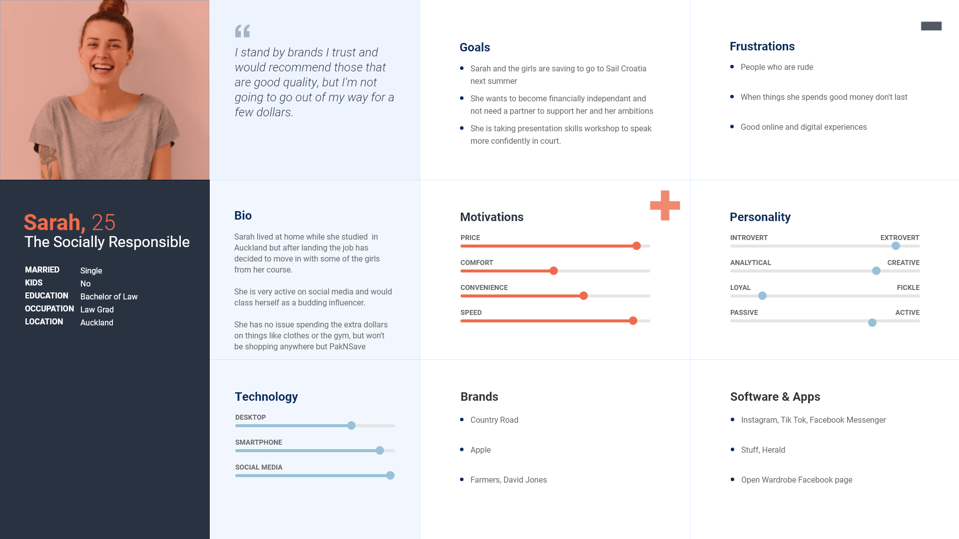
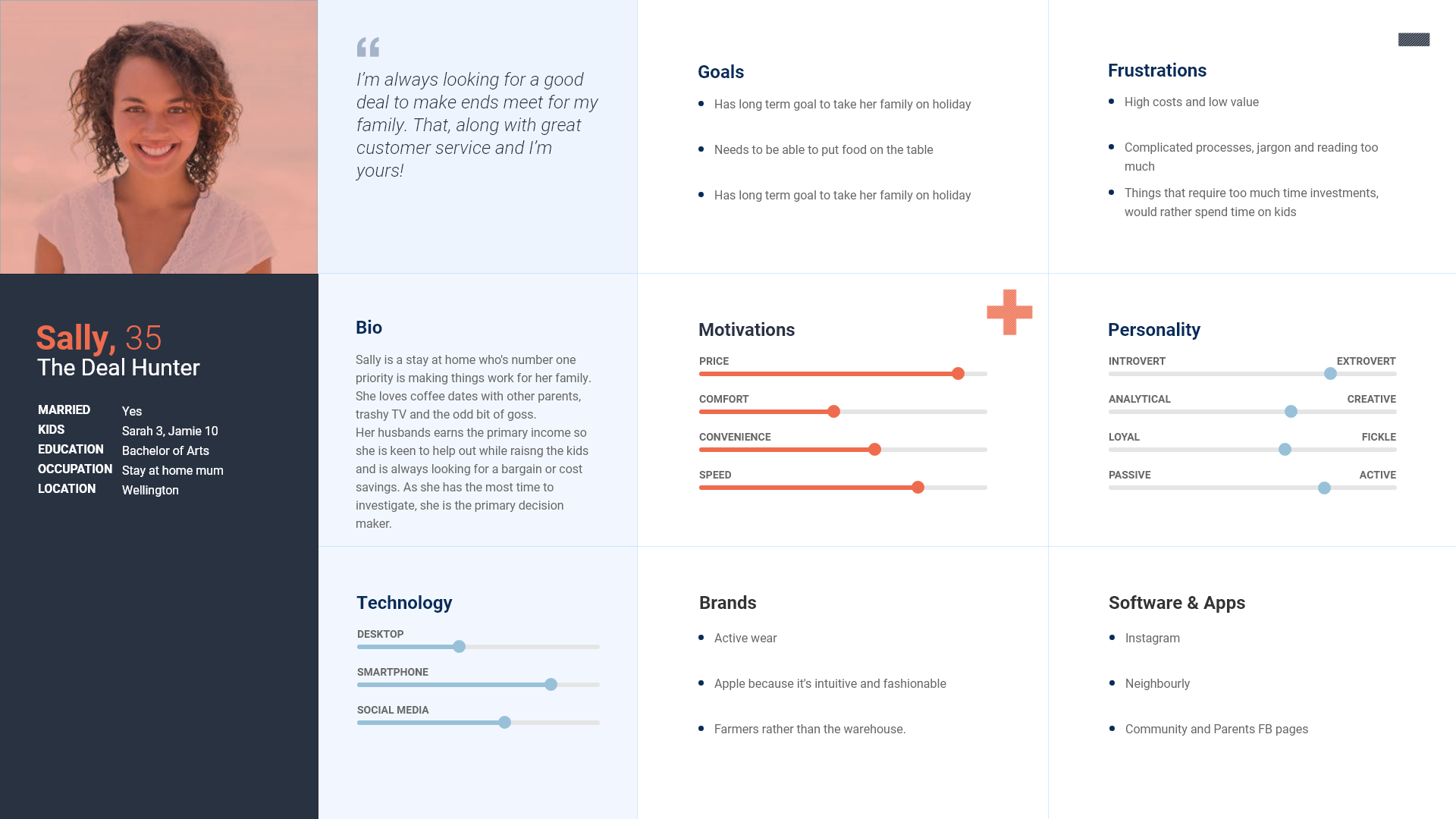

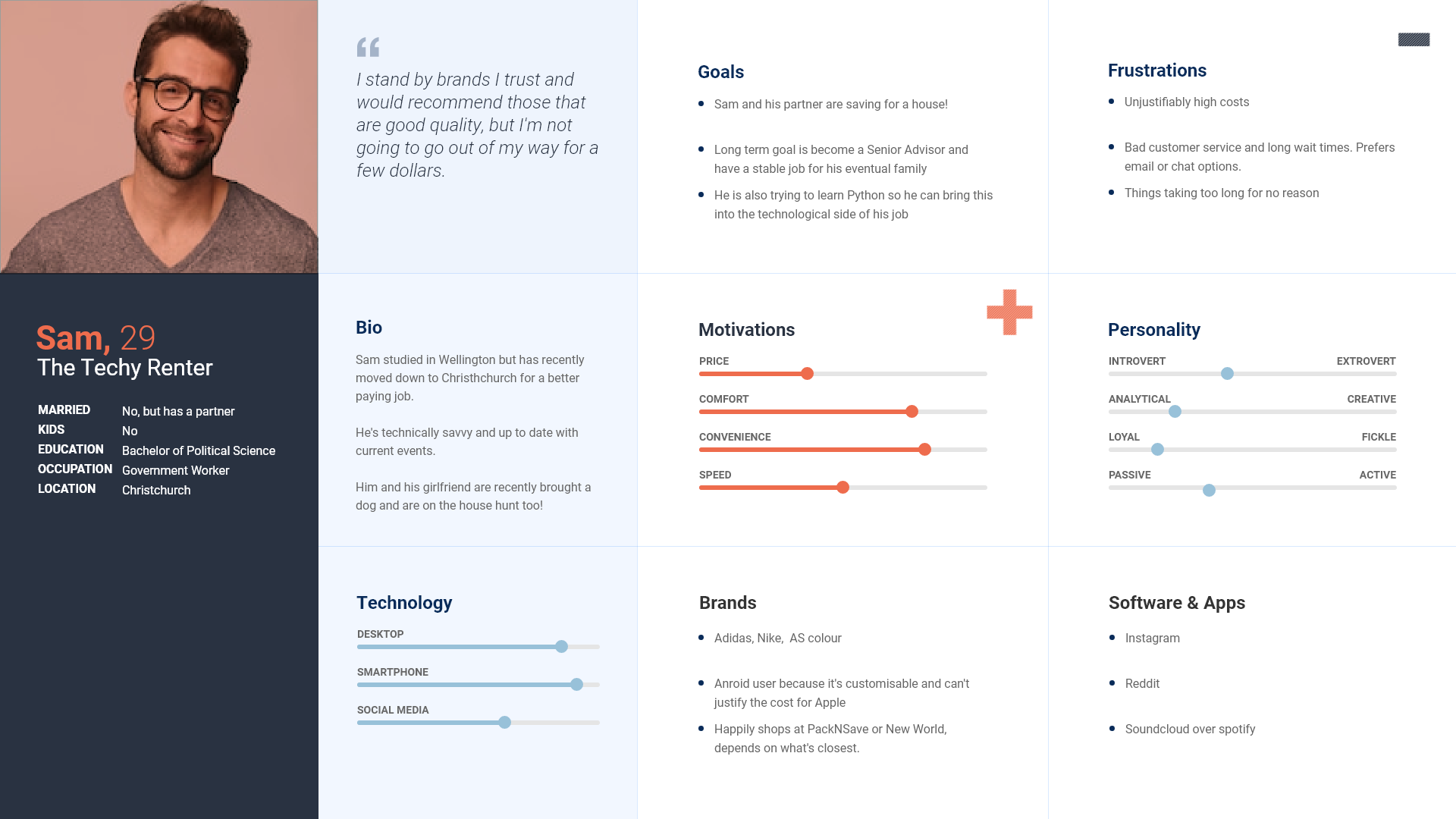
After exploring the personas, I chose two of these to focus on for the building of the customer journey - Sally the Deal hunter and Sam the techy renter.
These chosen personas fit the two main motivations that I came across in my research, these being the monetary benefit seeker and passive brand advocate.
Customer Journey Story
First interactions and mention of the FGF with the customers are based around the type of customer they are. Sam being a passive advocate has this delivered to him a) after positive customer service interactions b) personalised targeting in app and website. Sally on the other hand was delivered an email with the current broadband deal which she signed up to online and was sent out a follow up NPS survey as a result which featured the referral scheme.
Both customers are presented with FGF and Sally acts immediately after seeing link in the email and understanding the benefit. She follows the online journey which prompts her to download the app and sends her code to a number of friends and family. One of her friends has been shopping around for a power supplier so takes up the offer and joins contact. After 30 days, both Sally and the new customer receive their credit and have been managing this through the Contacts app and are digitally primed for Contact's services. After a few more weeks, Sally's friend is prompted with a notification to do a referral herself. She brings more family members on board (customers who refer are 4-5 more likely to refer someone themselves).
Sam on the other hand, had a slightly different journey. He is not motivated by the money but is happy to stand by the a product or brand he trusts. He had a good experience with customer service and was flagged as a high NPS customer after a few questions on the phone.
At a later date, Sam helps someone move house and he asks her if she is set up with her utilities. He is reminded Contact and their power, internet and gas all in one. He also remembers the referral scheme, so he opens the app, follows the prompts and flick her his code via messenger. A few days later he receives a notification that his code has been used and his friend is set up. Sam messages his friend with a congratulatory message.
The end solution must be intuitive and visible and be prompted the right places and times for a spectrum of motivations.
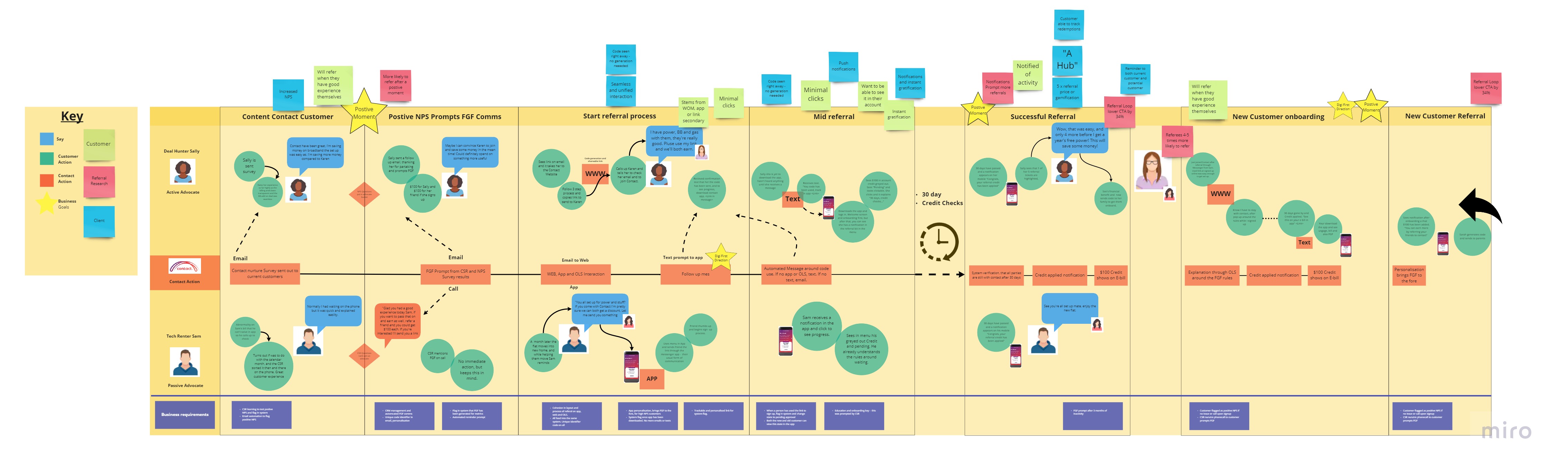 Click here to see full miro
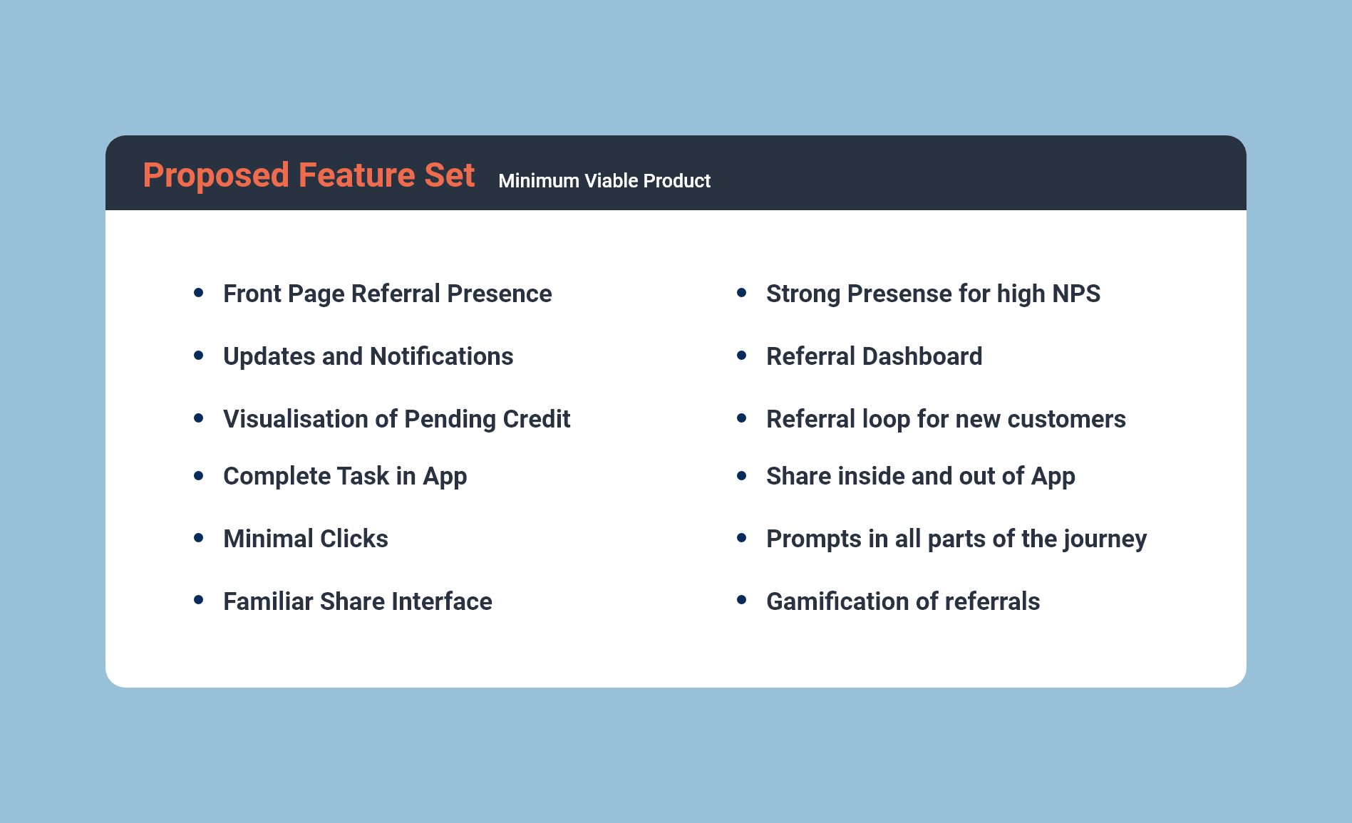
Taking into account themes from competitor and market research, highlights and recommendations from interviews and the surveys, and opportunities that surfaced during the customer journey and affinity map exercises, I landed on a range of features that could be included in the end solution.
These features were loaded on the below MVP matrix and ranked in terms of value and difficulty.
.jpg)
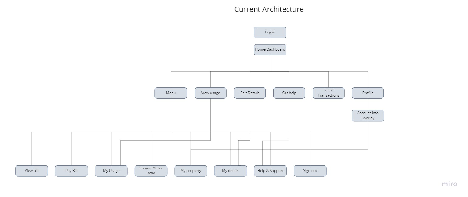
Looking to start building the prototypes for the first round of user testing, I broke down the current app and Online Service (OLS) down into the stage gates and menu items. Here I added in 'refer a friend' and got 3 participants to run through how they would go about referring a friend in the app with the given cards - as seen below.
Taking into account the three varied journeys from the exercise I built refer a friend into the apps current architecture. Two of the testers expected the FGF element to have a strong presence on the front page, while the other expected this built into the profile section - this meant the referral prompt should be in multiple areas or until tested further.
As well as this sitting alongside the elements in the main menu, the FGF prompts will be trialled in these areas to test effectiveness. The proposed architecture can be seen below.
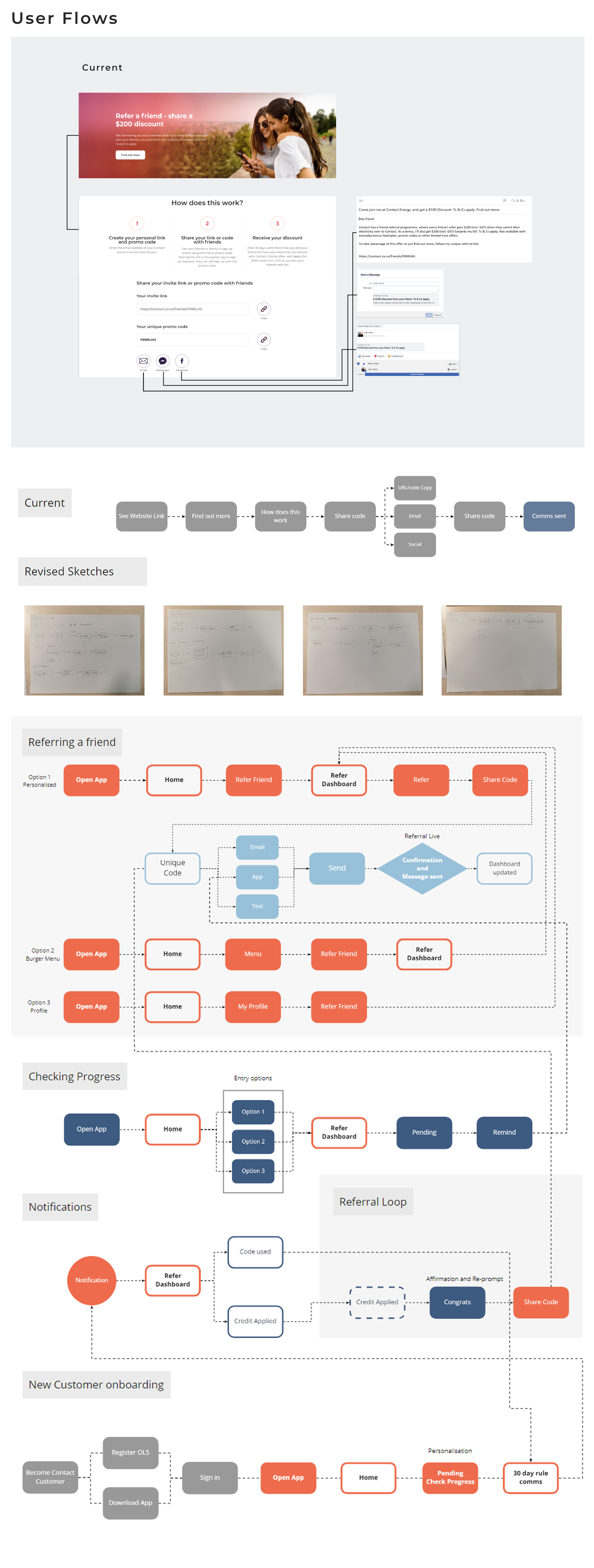
User flows
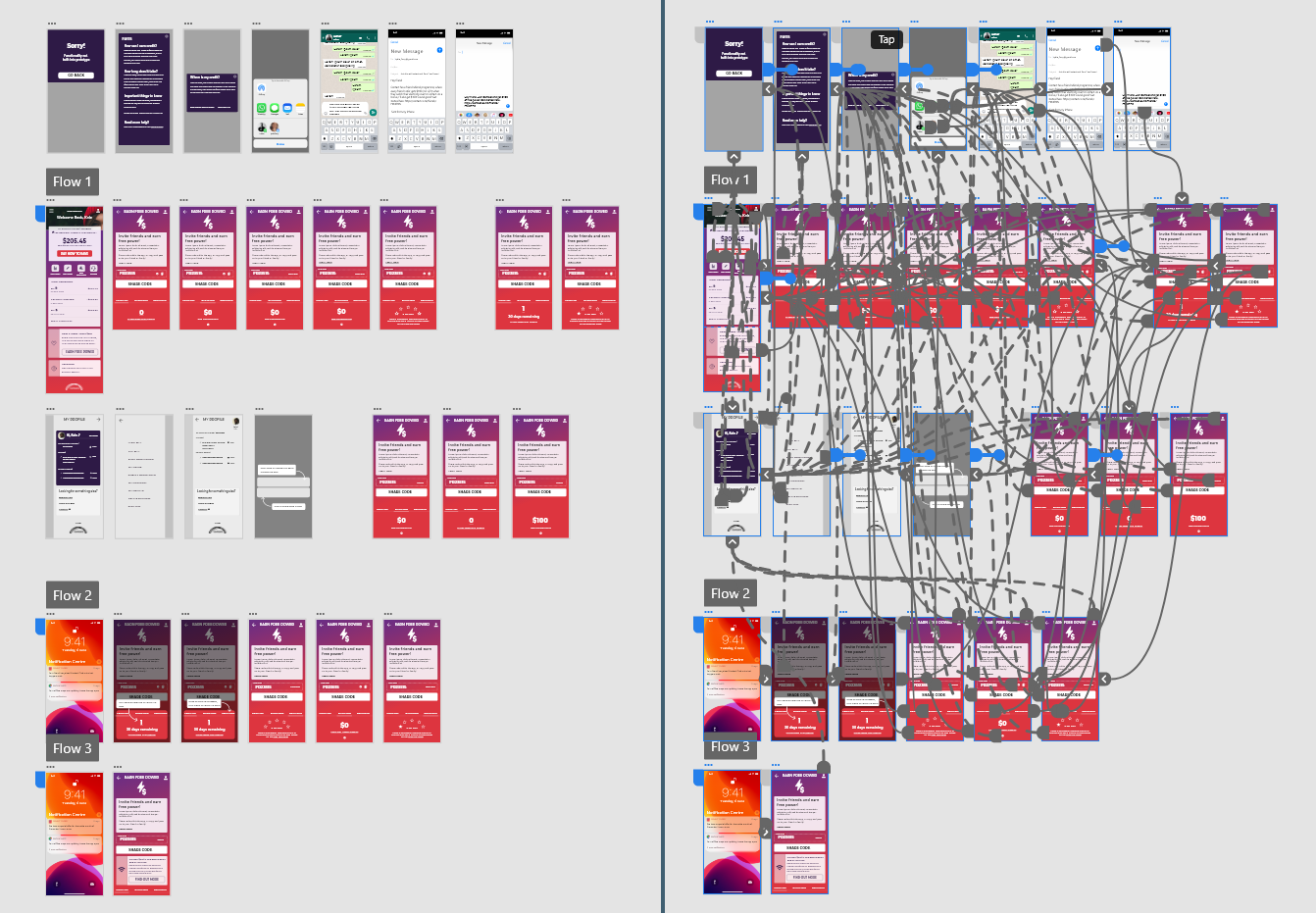
After this exercise, I moved onto user flows. These initially started on paper to get ideas down, but later these were moved onto miro to create a more structured model. Here I looked into a range of ways of referring a friend, the action of sharing a code, checking up on progress, receiving updates and notifications, and new customer onboarding. These were the core actions that a user would have using the app and was critical that these processes are smooth and intuitive.
.jpg)
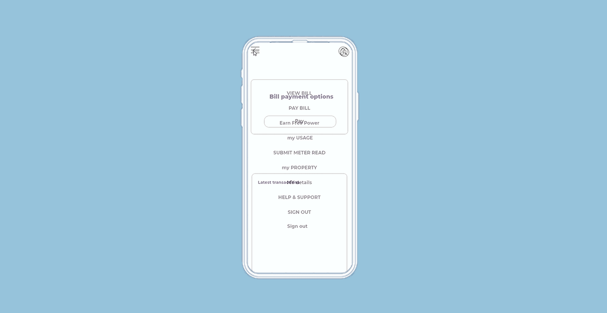
After exploring the user flows and additional information architecture, I moved onto giving these ideas more shape by sketching out a range of ideas and initial prototypes.
.jpg)
.jpg)
Current App
First I broke the app down into it's current elements to visualise it's architecture and flow. All of the navigation and movement was based off the main screen, and most of the info or smaller sections were pop ups.
Share Page Ideas
I started to explore the share page as this was going to be a critical element of the end product. I based the ideas loosely off of competitors and prior experience and started building flows and prototypes based off these.
.jpg)
.jpg)
Share link locations
As part of the interface sketch experiments, I wanted to look at locations of the link to the referral page. This was informed by the card sorting tests with the users. These are the areas where a) have editable dynamic content and b) where users highlighted as proposed locations for links.
Basic Flow
Based on the user flow exercise, I sketched out how this might look in action within the experience. The locations of the FGF prompts and the flows that came from that were storyboarded into a basic paper prototype.
After sketching the ideas and building the basic flows, it was time to bring them into Abobe XD and create some usable - and more importantly - testable prototypes.
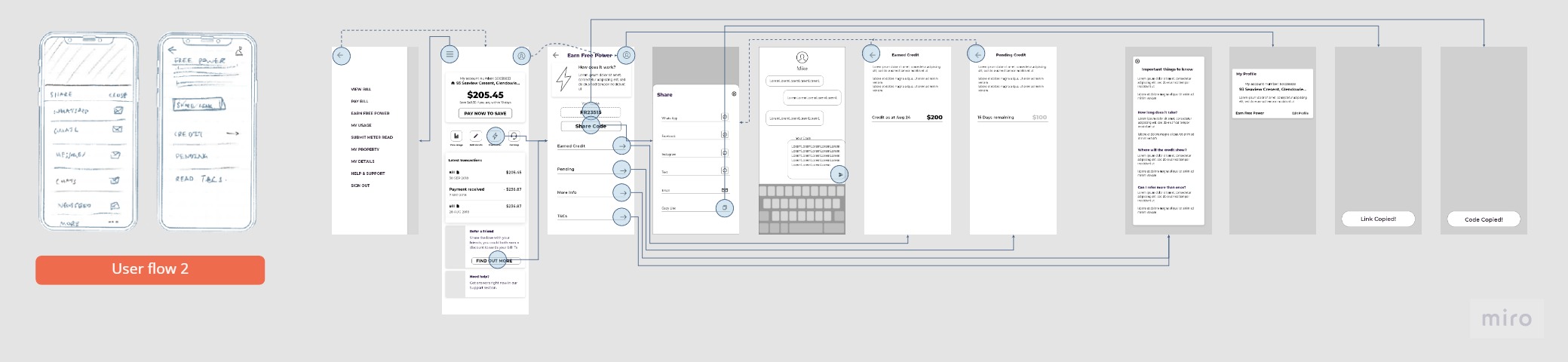
Low fidelity wireframes
I built three prototypes based on the proposed feature set and familiar share flows shown in alternate apps. Below are some of the feature inclusions and design decisions.

.jpg)
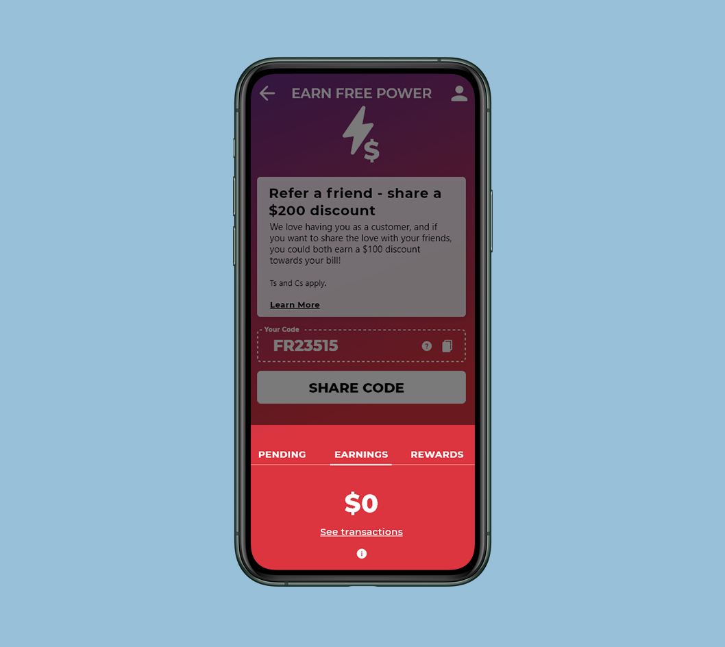
Share Page Ideas
Here I took the sketches and fleshed out three variations on a share page that I would base each prototype off. Each one features slightly different flow and are based on share flows discovered in my competitor and market research.
Share Sheet
The share sheet was another area I explored as this would be the second click in the customers journey. There are only two of the prototypes as the 3rd sheet was planned to be with inbuilt OS share sheet - depending on the device. Familiar and recent apps was going to be a winner.
.jpg)
.jpg)
CTA locations and prompts
These locations were chosen based on user feedback and the card sorting exercise. As long as not intrusive or off putting the FGF experience, the CTA could sit in multiple areas.
Further Sheets and Dialogues
Depending on the interfaces, exploration of extra sheets or pages was needed. The 'pending' and 'past' transactions were a suggested feature and the pop up module treatment was a already a large feature. The treatment of these needed to be tested in the prototypes
.jpg)
User Flow One
This prototype focused on a single dashboard and bespoke share sheet to minimise clicks.
User Flow Two
Flow two focused on a clearer and full screen share experience, this also meant the pending and transactions were clicks off the main page. The apps on the share sheet would be structured by frequently used.
.jpg)
User Flow Three
The third prototype featured a compact and all one page solution. This prototype also features the share sheet that will be pulled from the Mobile OS UI. Apps and contact of frequent use will be prompted first.
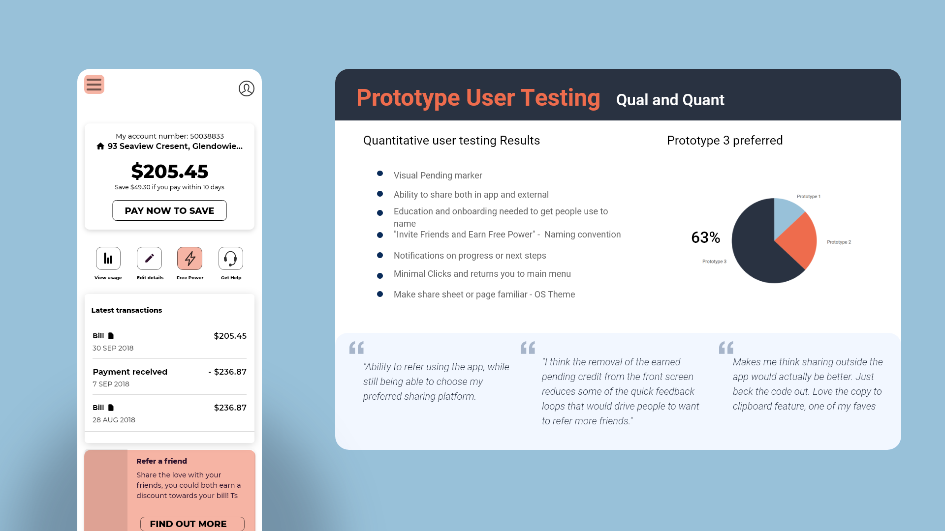
Prototype User Testing
With these prototypes build in XD, I was ready to test these amongst a small user group based on my proto personas. Here I got them to run through the three prototypes on a laptop and talk out loud around what they were thinking feeling and doing. What came out of this was a strong comfortability with the familiar, the share or action sheet that used the inbuilt OS UI seemed to work best for this audience and designs that were based of experiences they have already had with referrals were most popular. Onboarding and help widgets would be required to educate the users on their first share.
Another finding was that the flow with everything being featured on the one page (without having to search for pending or transaction) was popular. This showed presentation of relevant information and minimal clicks was important.
Survey
I also sent out a secondary quantitative survey with these three prototypes and some additional questions around naming conventions and CTA types. This survey resulted in prototype 3 and a familiar share sheet being voted the most popular. The naming convention of 'Invite Friends and Earn Free Power' and 'Invite Friends and Share $200' were preferred.
Share Page Trials
Now that the general flow and feature set had been tested and refined, I moved onto creating a hi res prototype and refined UI of my solution. As the main share page or dashboard was the most critical point of interaction for the scheme, I spend time designing multiple iterations in keeping within Contact’s brand guidelines. These were shown guerilla style to a small test audience and the client for their thoughts and opinions and the first option was chosen.
.jpg)
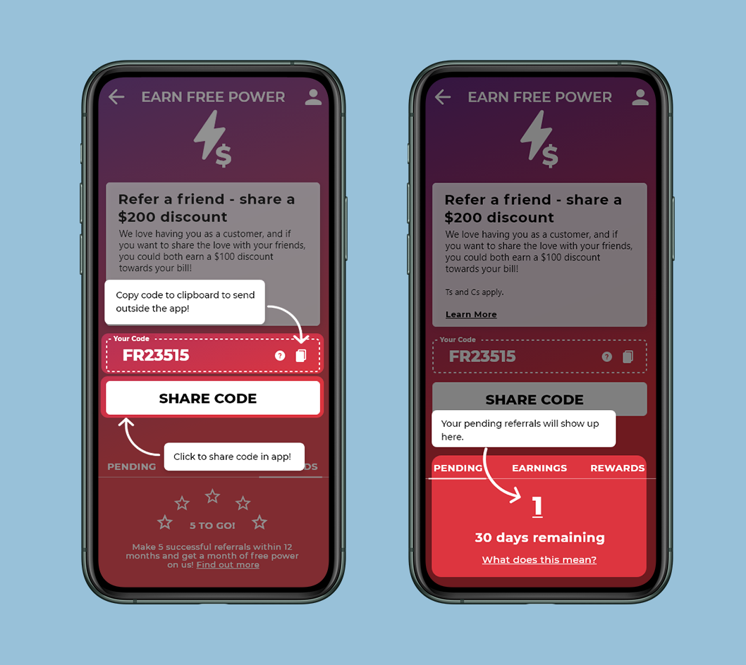
Onboarding and notifications
From here I tested and designed notifications and onboarding flows with help tools to get new customers accustomed to the experience.
.jpg)
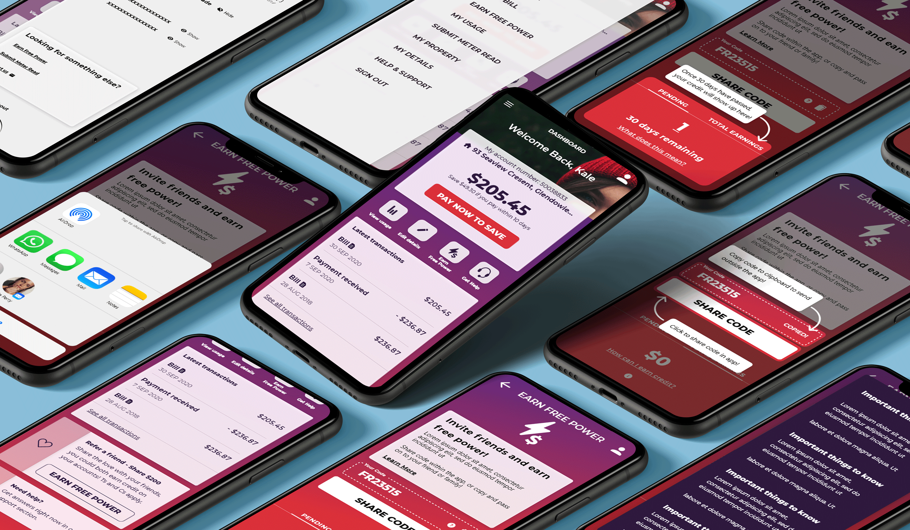
App prototype flow
I built each part of the experience in Adobe XD to create a polished prototype of the final solution. This was tested with a small audience and any pain points or user flow questions were ironed out in further iterations.
Features Inclusions

Dashboard
This dashboard was a client request and a hit with the users too. After an additional conversation and the development of the gamification dashboard (as seen below) we have arrived a a simple and clean soltuion.
Product Push and deal inclusion
Imagining a product special or promotion was another request from the client, I landed on this solution, similar to the personalisation dialogue which fit perfectly within the context of the app.
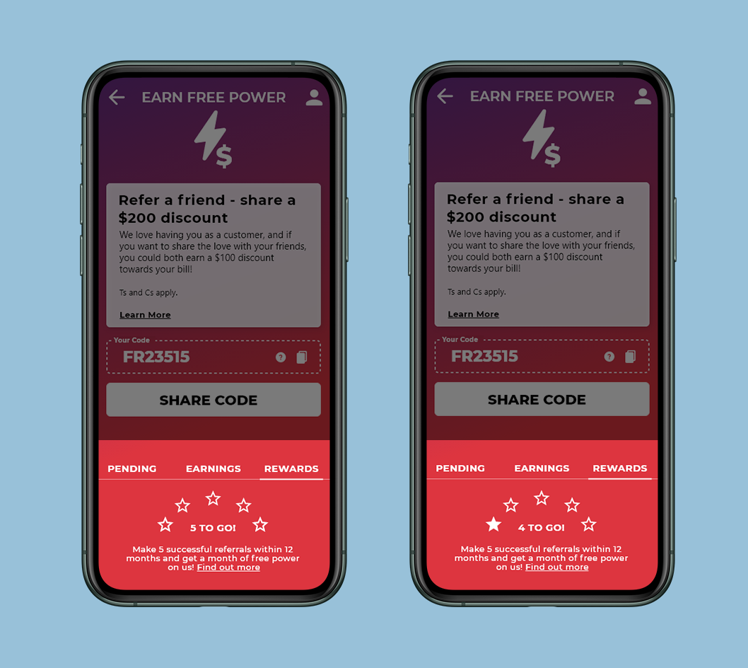
Gamification and double incentive
This feature was bought in late in the piece as a way to encourage additional referral and convey that the scheme is not a one and done idea. The stars fill up with each successful referral and if the user does 5 referrals within 12 month, they receive additional benefits.
Tool tips
As a way to communicate tricky decision points and aid in app customer onboarding, I designed this UI for user prompts which the client loved.